Data is everywhere. Most of it is useless—until it’s organized, visualized, and turned into something people can understand and act on. That’s where advanced data visualization comes in. It doesn’t just show numbers. It shows meaning.
If you’ve ever worked with complex reports or endless Excel rows and still struggled to answer a basic question, you’ve already felt the problem. Traditional charts can’t keep up anymore. We need more. Better visuals. More interaction. Real-time understanding.
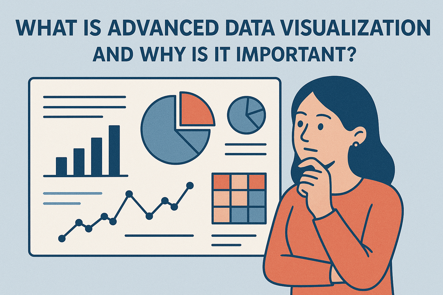
So, what exactly is advanced data visualization, and why has it become a must-have in every modern business? Let’s break it down without the fluff.
What Is Advanced Data Visualization?
Advanced data visualization refers to the use of interactive, high-capacity, and often real-time visual techniques to analyze and communicate large or complex datasets. These aren’t your basic bar graphs or pie charts.
We’re talking about:
- Dashboards that respond in real-time
- Charts that update as you filter
- Geospatial maps that pinpoint trends
- Time-series graphs showing where things are headed
- 3D visuals that represent more dimensions than a spreadsheet ever could
It allows people—technical or not—to see patterns, trends, outliers, and connections that raw data often hides. In fast-paced environments, that insight is power.
Why It Matters Now More Than Ever
Businesses are collecting more data than they can handle. Teams are spending more time digging through it than using it. Advanced visualizations solve that problem.
Why does it matter?
- Because leaders don’t have time to read 15-page reports.
- Because static reports age fast in real-time markets.
- Because charts should drive action, not confusion.
Whether you’re in healthcare, marketing, logistics, finance, or education, data visualization shortens the time between insight and decision. That’s critical when competition is high and margin for error is low.
Real-World Use Cases: Advanced Data Visualization Examples
Let’s skip the theory and talk about what this looks like in the real world. Here are a few advanced data visualization examples from different industries:
- Marketing: A media agency uses a multi-layer dashboard to track campaign performance across 20 platforms. Real-time metrics show engagement drops, and adjustments happen instantly.
- Healthcare: An analyst builds a heatmap dashboard that visualizes readmission rates by hospital ward and diagnosis. Doctors act before the data turns into another crisis.
- E-commerce: A retail team uses a cohort analysis chart to track customer lifetime value based on signup month. They spot a sharp drop in loyalty tied to a website redesign—and fix it.
These aren’t pretty pictures. They’re decision engines.
Best Data Visualization Techniques That Actually Work
Picking the right technique is just as important as collecting the right data. Some visuals are made to compare, others to explain movement, and others to highlight anomalies. Here are common and powerful data visualization techniques used in advanced practice:
- Time-series graphs: Best for showing trends over time (sales, traffic, temperatures).
- Sankey diagrams: Ideal for tracking flows, like user journeys or financial transfers.
- Heatmaps: Reveal density, intensity, or frequency across regions or categories.
- Bubble charts: Great for showing multiple variables in one space.
- Tree maps: Show parts of a whole, like revenue share by brand.
No single chart works for every case. Great data visualization is about matching technique to the story you need to tell.
The Tools Behind the Visuals
Software makes or breaks your ability to build visuals that work. Let’s talk tools. Here’s how top options deliver on advanced data visualization:
- Advanced visualization in Power BI: Power BI is a favorite for companies deep into Microsoft’s ecosystem. With DAX language and custom visuals, it enables rich, layered dashboards that update from live sources.
- Advanced data visualization Python: Python gives total control to developers. Using Plotly, Seaborn, or Dash, you can build anything from scientific plots to animated visuals. Perfect when flexibility is more important than interface.
- Advanced data visualization in R: R’s ggplot2 and Shiny apps are built for statisticians who want custom visual logic and presentation. R is ideal for academic or research-heavy environments.
- Tableau data visualization: Tableau is known for intuitive drag-and-drop, smart visuals, and enterprise scalability. Its visual storytelling makes it a go-to for data teams and exec dashboards.
- Other powerful data visualization tools include D3.js (for custom coding), Looker, Qlik, and Google Data Studio. Choose based on your tech stack and audience.
Why Static Visuals Just Don’t Work Anymore
Most organizations still rely on static PowerPoint slides and PDF reports to show data. That’s a problem.
Why?
- Data changes by the hour.
- Teams need to interact, explore, and compare.
- Static visuals hide more than they reveal.
Advanced data visualization supports interactivity. You can drill down, filter, and zoom in. You can ask new questions and get answers without rebuilding the report.
That’s what modern decision-making demands.
The 5 C’s of Data Visualization
To be effective, every data visual should check these boxes:
- Clear: Can someone look at it and instantly understand what it’s saying?
- Concise: Does it deliver insight without extra noise?
- Correct: Is the data accurate, current, and validated?
- Consistent: Do styles, labels, and formats match across visuals?
- Compelling: Does it guide attention to what matters most?
Most bad dashboards fail the first two.
The 7 Stages of Data Visualization
Here’s the workflow that takes you from chaos to clarity:
- Acquire: Gather the right data.
- Clean: Remove noise, fix formats, fill blanks.
- Structure: Organize for analysis.
- Analyze: Run models, test assumptions.
- Design: Choose the best visual forms.
- Build: Create visuals with logic, clarity, and flow.
- Deliver: Share with decision-makers.
If you skip steps, you’ll end up with misleading or ignored charts.
The 4 Types of Data Visualization
All visualizations fit into one (or more) of these types:
- Comparison: For side-by-side analysis (bar graphs, line charts).
- Composition: For seeing parts of a whole (pie charts, stacked bars).
- Distribution: For understanding spread (histograms, box plots).
- Relationship: For showing connections (scatter plots, bubble charts).
Advanced dashboards blend these types intelligently to show complex stories.
Do Certifications Help?
Short answer: Yes, but only if you apply them.
A solid advanced data visualization certification can teach you tools and theory fast. Courses on Coursera, LinkedIn Learning, edX, or vendor platforms like Tableau and Power BI are all good picks.
But the best way to master visualization? Build. Then rebuild. Test your dashboards with real users. You’ll learn what works and what doesn’t.
What PdSol.io Brings to the Table?
At PdSol.io, we help businesses take data from “what is this?” to “here’s what to do next.”
We specialize in advanced data visualization that supports fast, clear, and confident decisions. Whether you’re managing operations, leading product, running finance, or building a strategy team, we can help you make the data useful.
Here’s what that looks like:
- Custom dashboards built in Power BI, Python, R, or Tableau
- Visual strategy consulting (what to show, what to ignore)
- Audit and upgrade of existing dashboards
- Training your internal teams to manage and evolve the visuals themselves
We work with startups, scale-ups, enterprise teams, and everyone in between. Data’s not going away. But confusion around it can.
Final Thoughts
We don’t need more data. We need better ways to see it.
Advanced data visualization gives businesses the edge they need to act faster and smarter. It’s not about flash. It’s about clarity. And in a fast-moving world, that clarity can be the difference between reacting too late and leading the market.
If your data isn’t telling you what you need to know — or worse, it’s slowing you down — it’s time to fix it.
PdSol.io is here to help. Let’s make your data make sense.
